Marcel Duchamp & Man Ray
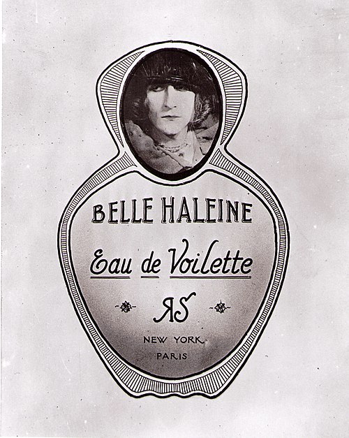
Belle Haleine — 1921
A Planted Backdrop
At first glance, it’s easy to mistake the backdrop in Belle Haleine for a simple studio flourish—a bit of theatrical drapery to set off the bottle and draw focus to the face of Rrose Sélavy.
But the backdrop is far from arbitrary. It isn’t just decorative—it’s a photograph of a painting. Closer inspection reveals that the image behind the bottle was created using the same subtle wash-and-remove technique seen in Morée.
This is the Veil Water process: a subtractive method in which ink or dye is rinsed away and repelled to form atmospheric effects, soft gradients, and hidden contours. What looks like photographic blur or design texture is, in fact, a hand-crafted surface that points directly back to Morée.
That connection changes how we understand Belle Haleine. The backdrop isn’t just framing the image— it’s part of its meaning. It reveals a deeper level of collaboration between Duchamp and Man Ray, one grounded not just in persona, but in process.
Pearls As A Theme
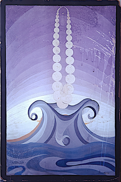
The pearls in Morée are visually central—deliberately placed, yet strangely detached from their traditional meaning.
Against the backdrop of a rising wave, the pearls there appear fragile and out of place—caught in motion, as if about to be overtaken. Their placement suggests not luxury, but vulnerability.
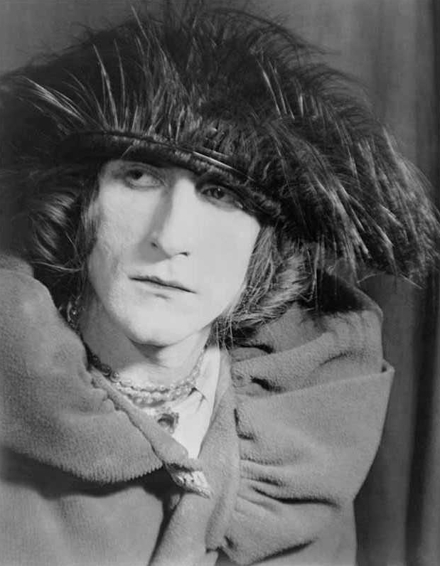
Pearls appear again in Belle Haleine, now worn by Duchamp in drag. Their presence
is one of several links between the two works. In both, the pearls help shift the
tone from glamour to irony.
They aren’t there to decorate—they’re there to disrupt. As part of a larger visual
and conceptual connection to Morée, the pearls signal a shared intent.
Turning the language of commercial art against itself.
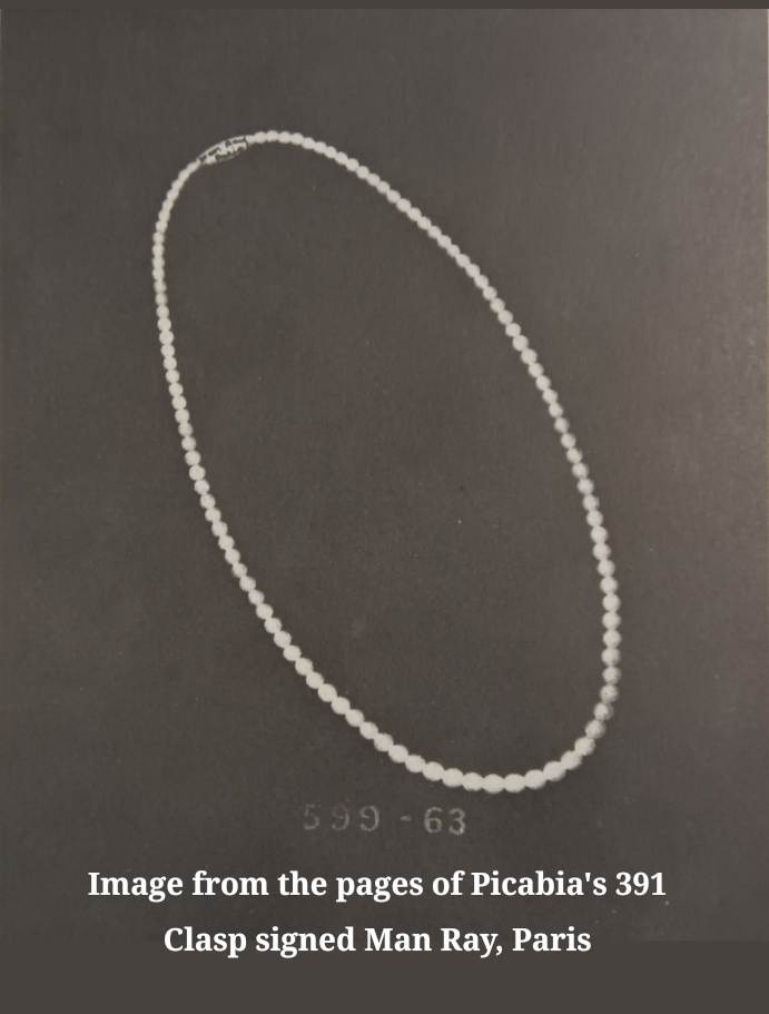
Man Ray String of Pearls in Picabia’s 391
In 1924, on page 4 of Picabia’s 391, Issue No. 18, a full-page image
appears: a single string of pearls, elegantly draped across a dark field.
On the clasp, in small text, is inscribed: “Man Ray, Paris.”This is not fashion. This is code.
The image functions as both mock advertisement and conceptual signature.
Pearls—long associated with bourgeois femininity, fashion excess, and
surface display—were already a recurring motif within Dada. Here, they are
isolated, commercialized, and rebranded under Man Ray’s name, turning
luxury into language.
This confirms that the pearl motif was active, shared, and deliberate within the Dada
visual lexicon. Pearls that were originally sabotaged in Morée.
Subverting the Commercial Image
Morée and Belle Haleine share a common strategy: they both mimic the language of commercial art in order to undermine it.
At first glance, Morée looks like an Art Deco fashion illustration, complete with graceful lines and a string of pearls. But its dissolving forms, subtractive technique, and haunting wave all push against the surface appeal—turning elegance
into critique.
Belle Haleine follows a similar path. Framed as a perfume advertisement, it borrows
the polished style of product photography, only to insert Duchamp in drag at the center.
The joke is layered, but pointed: the bottle is fake, the brand is made-up, and
the glamour is an illusion.
In both works, commercial aesthetics are used as bait—but what they deliver is
something entirely different. Together, they expose and dismantle the machinery of
surface-level appeal.
“Veil Water” The Perfume
The name “Veil Water” comes directly from Belle Haleine, Duchamp’s 1921 perfume-bottle readymade, a translation of Eau de Voilette.
We’ve adopted the term to describe the subtractive wash technique seen in
Morée—a process where ink or dye is applied, then rinsed or lifted to create
cloud-like gradients and drip patterns.
This isn’t just a convenient label. We believe Belle Haleine was titled Eau de Voilette—
Veil Water—in deliberate reference to the process used in Morée.
The name itself may be a coded acknowledgment of the process used to create the
ghostly drips present in both works.
A Possible Nod to Nude No. 3
Belle Haleine is most often described simply as a photograph of a perfume bottle, but in fact, if you look very carefully, it is a photograph of a photograph of a perfume bottle—an easy-to-miss doubling that subtly distances the viewer from the object.
This emphasis on photographic layering may serve as a quiet nod to the photographic nature of Duchamp’s Nude No. 3,
which was itself guided by a photograph and marks the first (probably accidental) appearance of the Veil Water effect.